

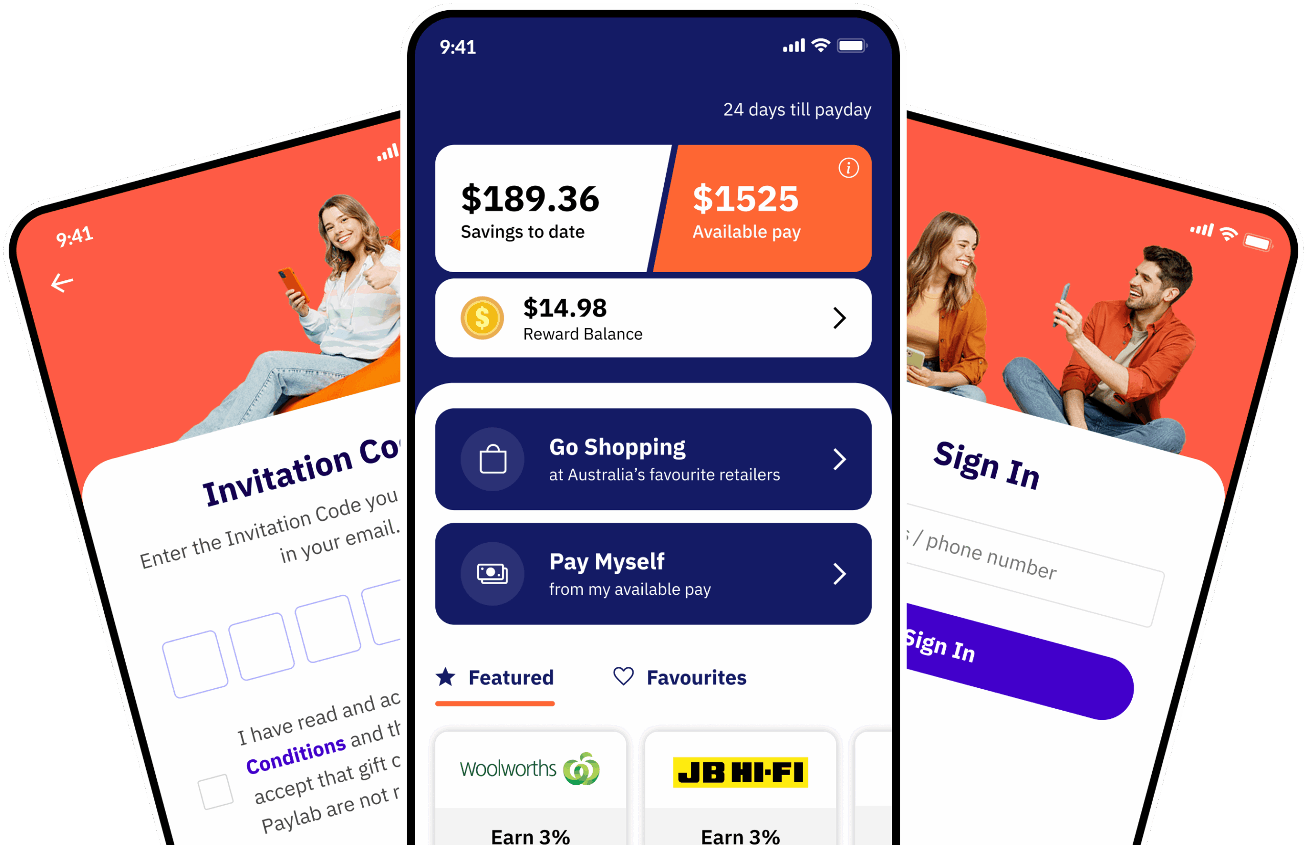
Paylab – FinTech B2B & B2C Mobile App
Research, Sketch, Wireframe, High-fidelity Prototype, Usability Testing.
Overview
Paylab is a modern FinTech platform serving both B2B and B2C audiences. The platform enables employees to conveniently access earned wages, purchase gift cards, and extend their spending power through an intuitive mobile app and a robust, scalable financial system.
The Challenge
The challenge was to improve usability by restructuring the app’s information architecture and redesigning the overall app experience, while maintaining core functionality. This involved balancing diverse user needs, seamlessly integrating new features into existing journeys, and ensuring visual consistency across the product, all within the constraints of the existing technical infrastructure.
Discovery
Understanding the business & user needs
Before redesigning the Paylab experience, I conducted stakeholder interviews and analysed user feedback to understand business priorities, technical constraints, and the biggest pain points affecting users.
Research at a glance
Stakeholder breakdown
I interviewed stakeholders across leadership, product, QA, marketing and customer support to understand the business goals, operational challenges and recurring customer pain points.
| Stakeholders | |
|---|---|
| Leadership | CEO, CTO |
| Product | Product Manager |
| Quality | 2 x QA Engineer |
| Marketing | Marketing Manager |
| Customer | Customer Support Lead |
What we heard
Stakeholder priorities
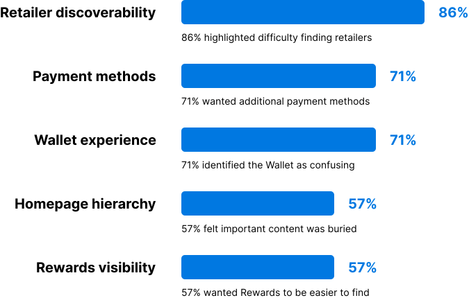
Based on stakeholder interviews, retailer discoverability emerged as the highest-priority usability issue, followed by payment flexibility and simplifying the Wallet experience.
Affinity mapping
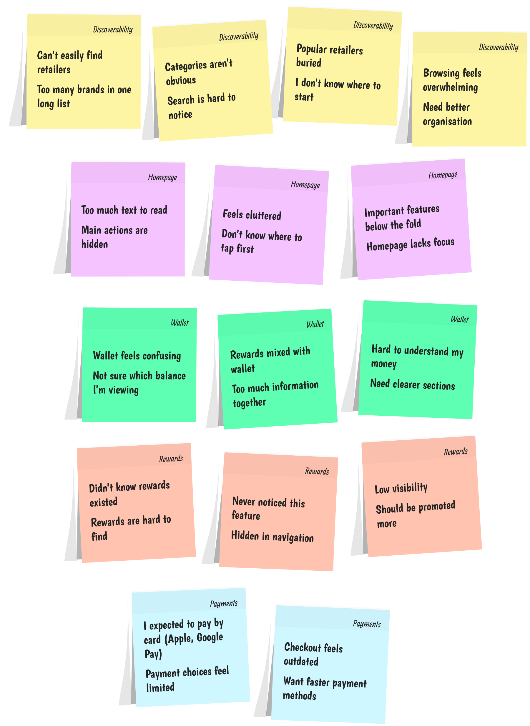
Insights gathered from stakeholder interviews, customer support feedback, and usability observations were grouped into key themes to identify recurring pain points. These findings directly informed the redesign priorities for the Paylab mobile experience.
Synthesised research insights
| Observed | Insight | Opportunity | |
|---|---|---|---|
| Retailer discovery | Users struggled to find retailers. | The existing retailer experience didn’t support efficient browsing or discovery. | Introduce categories and improve retailer navigation. |
| Payment flexibility | Stakeholders wanted card payments. | The existing payment experience limited how users could complete purchases. | Introduce Debit/Credit Cards, Google Pay and Apple Pay. |
| Wallet complexity | Users found the Wallet confusing. | Multiple types of financial information competed for attention. | Restructure the Wallet around users’ primary tasks and balances. |
| Homepage overload | The homepage contained too much information. | Promotional and informational content competed with core actions. | Establish a clearer content hierarchy around the user’s most important tasks. |
| Rewards visibility | Rewards were difficult to discover. | Rewards lacked a clear place within the overall product architecture. | Give Rewards a dedicated and more visible experience. |
Design priorities
Insights gathered from stakeholder interviews, customer support feedback, and usability observations were grouped into key themes to identify recurring pain points. These findings directly informed the redesign priorities for the Paylab mobile experience.
User flow
After identifying retailer discoverability as the highest-priority issue, I streamlined the journey by reducing friction, improving navigation, and making key actions easier to discover. These user flows helped ensure that users could accomplish their most important tasks easily, with fewer steps and less cognitive load.
Purchasing gift cards

Accessing accrued wages

Solutioning
Paper sketches
After discovery, I moved into low-fidelity exploration by sketching early concepts for the revised app layout and user flows. This approach allowed me to rapidly iterate on ideas, validate screen hierarchy, and refine content distribution without the constraints of high-fidelity design tools. Although rough, these sketches were instrumental in visualising the new structure and facilitating quick, collaborative discussions with the team before progressing to detailed design.


Wireframe
The next step was to translate the paper sketches wireframes. The goal at this stage was to visualize the layout and flow of the app without getting bogged down by visual details. These wireframes allowed me to focus on the user journey, ensuring that each key action could be completed with minimal friction.


Visual design
With the functionality and flow established, I moved on to crafting the visual designs. The goal was to create a modern, professional aesthetic that aligned with the Paylab brand but also felt intuitive and familiar to users. I adopted a clean, minimalist approach with consistent spacing, typography, and iconography that enhanced usability without overwhelming the user with excessive visual elements.
Color schemes were carefully chosen to reflect trust, professionalism, and simplicity. Visual hierarchy played a key role in guiding users through key actions, such as tracking payments or generating invoices, with clear call-to-action buttons and distinct states for primary and secondary actions.


Outcome
The Paylab redesign transformed key user pain points into a simpler, more efficient experience. Through user-centred design, stakeholder collaboration, rapid iteration, and A/B testing, the project delivered measurable improvements across the app.
Key outcomes following the feature relaunch: