
Paylab – FinTech B2B & B2C Mobile App

Research, Sketch, Wireframe, High-fidelity Prototype, Usability Testing.

Overview

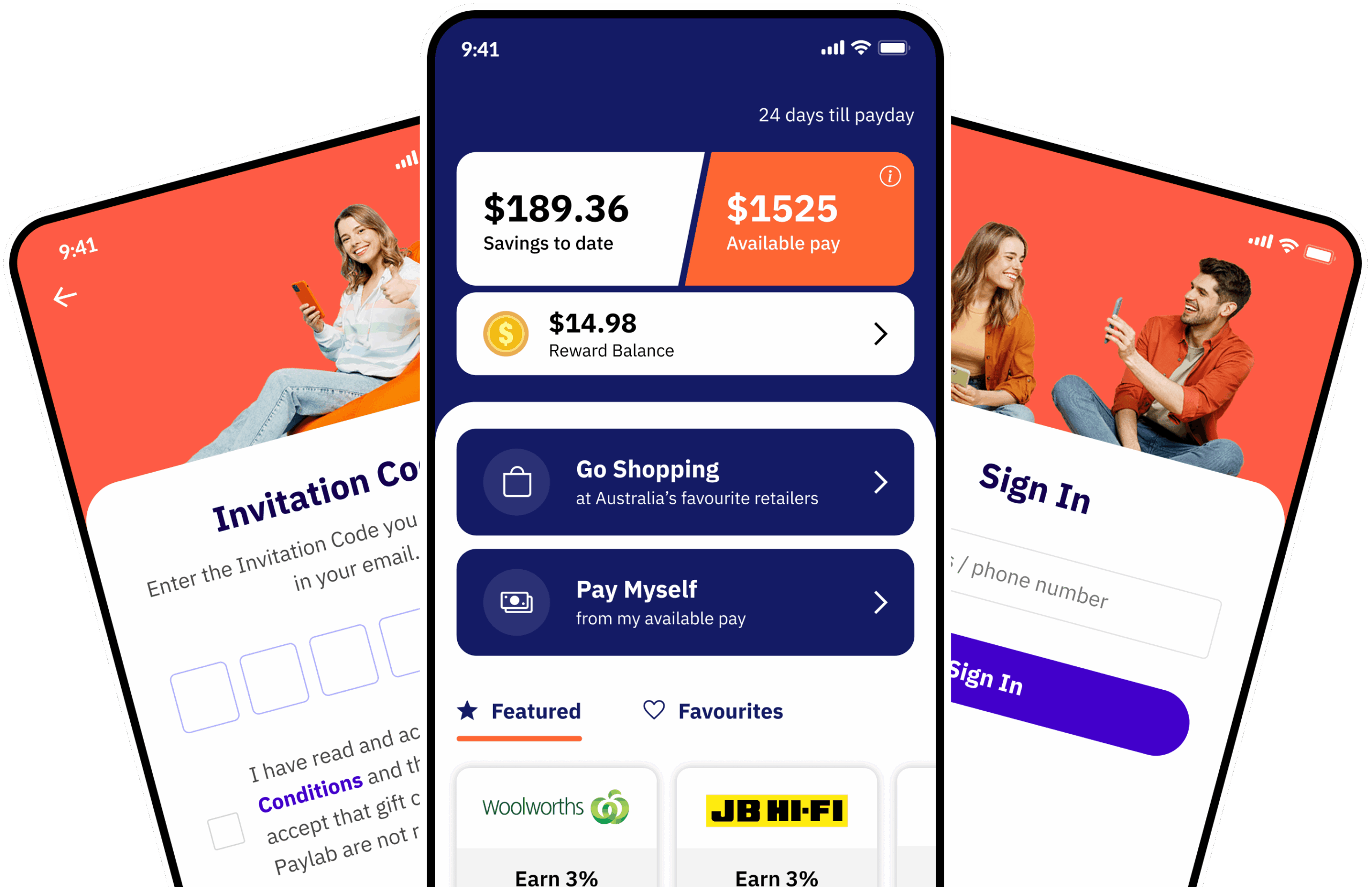
Paylab is a modern FinTech platform serving both B2B and B2C audiences. The platform enables employees to conveniently access earned wages, purchase gift cards, and extend their spending power through an intuitive mobile app and a robust, scalable financial system.

The Challenge

The challenge was to improve usability by restructuring the app’s information architecture and redesigning the overall app experience, while maintaining core functionality. This involved balancing diverse user needs, seamlessly integrating new features into existing journeys, and ensuring visual consistency across the product, all within the constraints of the existing technical infrastructure.

Discovery

Understanding the business & user needs

Before redesigning the Paylab experience, I conducted stakeholder interviews and analysed user feedback to understand business priorities, technical constraints, and the biggest pain points affecting users.

Research at a glance
Stakeholder breakdown

I interviewed stakeholders across leadership, product, QA, marketing and customer support to understand the business goals, operational challenges and recurring customer pain points.

Stakeholders
Leadership CEO, CTO
Product Product Manager
Quality 2 x QA Engineer
Marketing Marketing Manager
Customer Customer Support Lead
What we heard
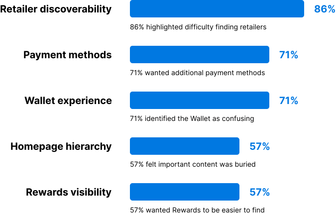
Stakeholder priorities

Based on stakeholder interviews, retailer discoverability emerged as the highest-priority usability issue, followed by payment flexibility and simplifying the Wallet experience.
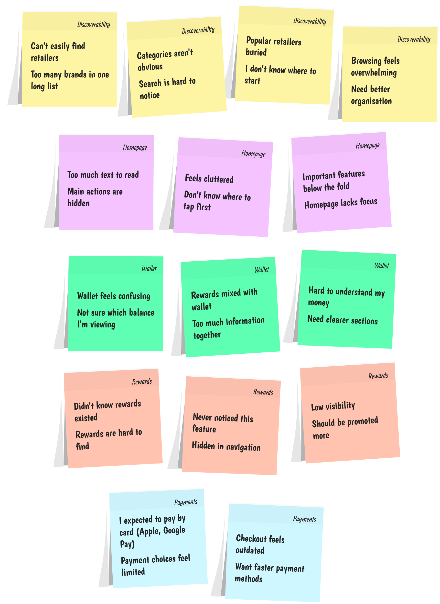
Affinity mapping

Insights gathered from stakeholder interviews, customer support feedback, and usability observations were grouped into key themes to identify recurring pain points. These findings directly informed the redesign priorities for the Paylab mobile experience.
Business objectives
Synthesised research insights
Observed Insight Opportunity
Retailer discovery Users struggled to find retailers. The existing retailer experience didn’t support efficient browsing or discovery. Introduce categories and improve retailer navigation.
Payment flexibility Stakeholders wanted card payments. The existing payment experience limited how users could complete purchases. Introduce Debit/Credit Cards, Google Pay and Apple Pay.
Wallet complexity Users found the Wallet confusing. Multiple types of financial information competed for attention. Restructure the Wallet around users’ primary tasks and balances.
Homepage overload The homepage contained too much information. Promotional and informational content competed with core actions. Establish a clearer content hierarchy around the user’s most important tasks.
Rewards visibility Rewards were difficult to discover. Rewards lacked a clear place within the overall product architecture. Give Rewards a dedicated and more visible experience.
Design priorities

Insights gathered from stakeholder interviews, customer support feedback, and usability observations were grouped into key themes to identify recurring pain points. These findings directly informed the redesign priorities for the Paylab mobile experience.

User flow

After identifying retailer discoverability as the highest-priority issue, I streamlined the journey by reducing friction, improving navigation, and making key actions easier to discover. These user flows helped ensure that users could accomplish their most important tasks easily, with fewer steps and less cognitive load.

Purchasing gift cards

Accessing accrued wages

Solutioning

Paper sketches

After discovery, I moved into low-fidelity exploration by sketching early concepts for the revised app layout and user flows. This approach allowed me to rapidly iterate on ideas, validate screen hierarchy, and refine content distribution without the constraints of high-fidelity design tools. Although rough, these sketches were instrumental in visualising the new structure and facilitating quick, collaborative discussions with the team before progressing to detailed design.

Wireframe

The next step was to translate the paper sketches wireframes. The goal at this stage was to visualize the layout and flow of the app without getting bogged down by visual details. These wireframes allowed me to focus on the user journey, ensuring that each key action could be completed with minimal friction.

Home

To enhance user engagement and accessibility, I created a Personalised Home Page that provides a quick snapshot of essential financial insights while ensuring seamless navigation to key features. The goal was to create a dynamic, user-centric dashboard that offers both clarity and convenience. Key features focused on:

  • Personalised financial overview displaying Savings to Date, Available Pay, and Reward Balance for instant visibility.
  • Quick access to Featured and Favourite Retailers, ensuring a curated shopping experience.
  • An intuitive layout that prioritises relevant user information while maintaining a clutter-free experience.

Retailer Categorisation & Search

To enhance the browsing experience and improve discoverability, I created a structured Retailer Categorisation System that organises retailers into intuitive categories. This approach simplifies navigation, making it effortless for users to find their preferred brands while also offering a quick search option for direct access.

  • Retailers are grouped into meaningful categories to streamline the browsing experience.
  • Category titles for easy recognition, reducing cognitive load and improving accessibility.
  • Search functionality to allow users to find specific retailers instantly.

Rewards

To provide users with full visibility and control over their rewards, I created a dedicated Rewards page that offers a clear breakdown of earned and used rewards while enabling seamless transfers. The goal was to ensure users can easily track, manage, and utilise their rewards with confidence.

  • Real-time Rewards Balance display for instant visibility of available rewards.
  • Seamless reward transfers, allowing users to move rewards as needed.
  • Comprehensive Rewards History, detailing earned and used rewards for each transaction to maintain complete transparency.

Transfer Rewards

To enhance user flexibility and control, I created a Transfer Rewards page that allows users to effortlessly transfer their earned rewards. The goal was to provide a smooth and intuitive experience where users can select from configured transfer options and choose the exact amount they wish to transfer.

  • User-controlled transfer amount for complete flexibility.
  • Pre-configured transfer options to ensure a hassle-free process.
  • Simple and intuitive interface that guides users through a seamless transaction.

Wallet

To improve the usability and accessibility of purchased gift cards, I created a streamlined Wallet page where users can easily view and manage their stored cards. The goal was to create an intuitive stacking system that efficiently organises multiple cards while keeping the interface clean and visually appealing.

  • Gift cards are stacked, with a maximum of three visible cards at a time to maintain clarity and reduce clutter.
  • The latest purchased card appears on top, ensuring easy access to the most relevant card.
  • A seamless transition and expandable interaction allow users to browse through older cards effortlessly.

Gift Card Details

To enhance the usability and accessibility of purchased gift cards, I created a dedicated Gift Card Details page that provides users with all essential information in one place. The goal was to ensure a seamless experience for both in-store and online redemption while offering additional features for better card management.

  • Clear Display of Gift Card Value to provide instant visibility of the available balance.
  • In-Store & Online Gift Card Number with PIN for easy access during redemption.
  • The notes section allows users to add personal reminders or annotations.
  • Details section to track transaction information.
  • Check Balance option to keep users informed of their remaining funds.

Gift Card Purchase

To create a frictionless and transparent gift card purchasing experience, I created an intuitive Gift Card Purchase Flow that empowers users with clear financial insights and flexible options. The goal was to ensure users can easily select, customise, and purchase gift cards while being fully aware of their balance, rewards, and discounts.

  • Real-time display of available balance and rewards to inform users of their spending power.
  • Transparent discount visibility to highlight savings before purchase.
  • Quick-select prefixed amounts for convenience, along with a custom entry option for flexibility.

Checkout Experience

A smooth and intuitive Confirm Purchase Page is essential to ensure a frictionless checkout experience. I created a user-friendly payment flow that prioritises ease of use, offering multiple payment options while seamlessly integrating rewards for added convenience.

  • Multiple payment options including available balance, Google Pay, Apple Pay, and the ability to add a debit/credit card.
  • One-tap ‘Use Rewards’ toggle allowing users to instantly deduct rewards from their total balance.
  • Clear and intuitive interface ensuring a quick and hassle-free checkout experience.

Payment Method Management

To enhance user control and flexibility, I created a Payment Method Management page that allows users to easily manage their saved payment options. The goal was to ensure a smooth and intuitive experience for adding, deleting, and selecting a preferred payment method.

  • Add or delete payment methods effortlessly for complete control over payment options.
  • Set a default payment method for faster, more convenient checkouts.
  • Clear and intuitive interface that simplifies payment management and reduces friction.

Visual design

With the functionality and flow established, I moved on to crafting the visual designs. The goal was to create a modern, professional aesthetic that aligned with the Paylab brand but also felt intuitive and familiar to users. I adopted a clean, minimalist approach with consistent spacing, typography, and iconography that enhanced usability without overwhelming the user with excessive visual elements.

Color schemes were carefully chosen to reflect trust, professionalism, and simplicity. Visual hierarchy played a key role in guiding users through key actions, such as tracking payments or generating invoices, with clear call-to-action buttons and distinct states for primary and secondary actions.

Designing a Personalised & Insightful Home Experience

By offering a well-structured and personalized home screen, this design empowers users with clear financial insights, quick access to key actions, and a seamless way to engage with their favourite retailers.

Optimising Retailer Discovery with Categorisation & Search

This refined categorisation system enhances user engagement by offering a structured, user-friendly way to explore retailers, ensuring a seamless and efficient shopping experience.

Enhancing Transparency & Flexibility with a Rewards Page

This intuitive design empowers users with clear insights into their rewards, enhances engagement, and provides a seamless experience in managing and utilising earned benefits.

Seamless & Flexible Transfer Rewards

This design empowers users with greater control over their rewards, making it easy to transfer and utilise earned benefits efficiently while maintaining a smooth and frictionless experience.

Enhancing the Wallet Experience for Gift Cards

This design approach enhances usability by prioritising recency and reducing cognitive load, ensuring a smooth and engaging wallet experience for users.

Redefining the Gift Card Details Experience

This intuitive design simplifies the user journey, making it easier to manage and redeem gift cards while ensuring a frictionless and user-friendly experience.

Seamless & Rewarding Gift Card Purchase Experience

This user-centric approach enhances trust, provides financial clarity, and streamlines the gift card purchasing journey, making it a rewarding and hassle-free experience.

Streamlining the Gift Card Checkout Experience

This optimized design minimizes checkout friction, enhances user confidence, and provides a seamless transaction experience, making gift card purchases effortless and rewarding.

Simplifying Payment Method Management for a Seamless Checkout

This streamlined payment management system enhances user convenience, ensuring a frictionless transaction experience while providing full control over preferred payment options.

Outcome

By following a structured, user-centred design process, the Paylab app redesign successfully addressed key pain points and transformed it into a modern, efficient platform. The project’s success was built on collaboration with stakeholders, a deep understanding of user needs, iterative design and prototyping, and data-driven decision-making through A/B testing. The result was a feature-rich, intuitive app that not only aligned with business objectives but also greatly enhanced user satisfaction.